

TL;DR
Google Sheets uses the FORECAST function to predict future values based on existing data. By applying linear regression, it calculates an expected y-value for a given x-value. The basic syntax is =FORECAST(x, data_y, data_x). This tool is perfect for estimating straightforward trends, such as projecting future sales based on historical performance, without needing complex statistical software.
Understanding the Core FORECAST Function
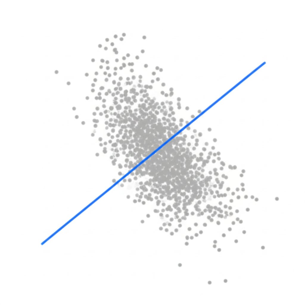
At its heart, the FORECAST function in Google Sheets is a tool for making predictions based on historical data. According to Google's official documentation, it calculates the expected y-value for a specified x based on a linear regression of a dataset. In simpler terms, it finds the straight line that best fits your past data and extends that line to predict a future point. It's important to note that the FORECAST and FORECAST.LINEAR functions are identical, giving you the same result.
To use it effectively, you need to understand its three key arguments:
- x: The independent data point you want to forecast a value for. For example, if you're forecasting sales, this could be a future month or year.
- data_y: The range of your dependent data. These are the known values you want to project, such as your past monthly sales figures.
- data_x: The range of your independent data. These are the known data points that correspond to your
data_yvalues, like the month numbers (1, 2, 3, etc.).
The basic syntax looks like this:
=FORECAST(x, data_y, data_x)
For this function to work correctly, there are a few critical rules to follow. First, all data points in your ranges must be numerical; any text will cause an error. Second, the data_y and data_x ranges must be the same size. If one range has more cells than the other, the formula will return a #N/A error. Understanding these components is the first step toward building accurate and reliable forecasts.
Step-by-Step Guide: How to Use FORECAST in Google Sheets
Putting the FORECAST function to work is a straightforward process. This section provides a practical walkthrough for forecasting future sales based on historical data, a common business use case. By following these steps, you can quickly turn your past performance data into a valuable future projection.
First, ensure your data is organized correctly. You need two columns: one for your independent variable (data_x) and one for your dependent variable (data_y). For a sales forecast, this would typically be 'Month Number' and 'Sales Revenue'.
- Set Up Your Data: In Column A, list the periods (e.g., 1, 2, 3 for months). In Column B, list the corresponding sales figures for each period.
- Select the Target Cell: Click on an empty cell where you want your forecasted value to appear.
- Enter the Formula: Type
=FORECAST(into the cell. - Specify the Future 'x': After the opening parenthesis, click on the cell that contains the future period you want to predict (e.g., month 13). Add a comma.
- Select the Known 'y' Data: Highlight the entire range of your historical sales data (your
data_y). It's a best practice to make this an absolute reference by pressing F4 (e.g.,$B$2:$B$13) so it doesn't shift if you drag the formula. Add a comma. - Select the Known 'x' Data: Highlight the entire range of your historical periods (your
data_x). Make this an absolute reference as well (e.g.,$A$2:$A$13). - Calculate the Forecast: Close the parenthesis and press Enter. The cell will now display the projected sales figure for your specified future period.
By following this structured approach, you can reliably calculate single or multiple future data points. The use of absolute references (the `$` signs) is particularly useful, as it allows you to drag the formula down to forecast several future periods without having to rewrite it each time.
Advanced Forecasting: Beyond Linear Trends
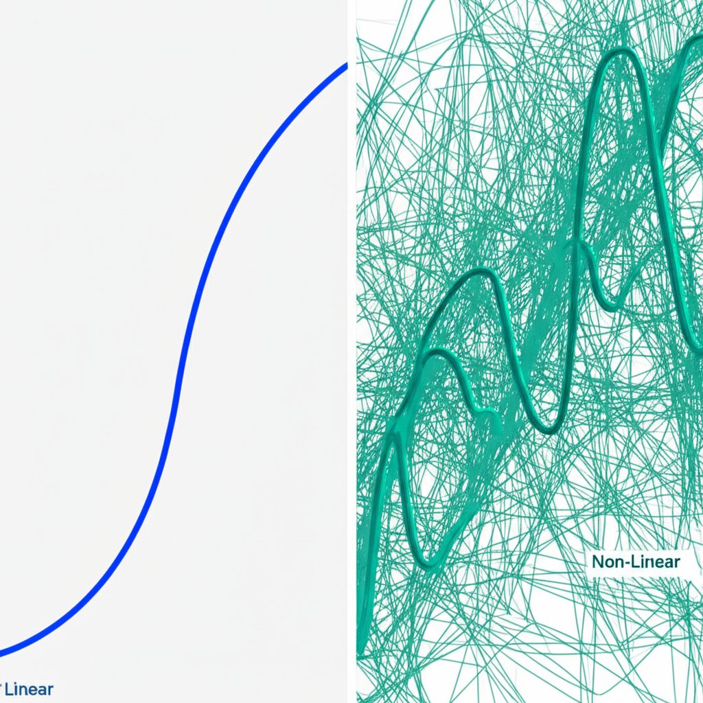
While the FORECAST function is powerful, its greatest limitation is that it only works for linear trends—data that follows a relatively straight line. If your data has seasonality (regular peaks and valleys) or shows exponential growth (curving upwards at an increasing rate), a simple linear forecast can produce misleading or nonsensical results. For these more complex scenarios, Google Sheets offers several alternative methods.
Understanding which tool to use is key. For data that curves upward, like a rapidly growing startup's user base, the GROWTH function is more appropriate as it fits an exponential trend. For highly volatile data with lots of noise, a Moving Average can help smooth out the fluctuations to reveal an underlying trend. For businesses with strong seasonal patterns, such as retail sales peaking in December, more advanced methods or specialized add-ons are necessary.
To help you choose the right approach, here is a comparison of different forecasting methods available in Google Sheets:
| Method | Best Use Case | Complexity | Data Requirements |
|---|---|---|---|
| FORECAST / FORECAST.LINEAR | Steady, straight-line trends | Low | Two corresponding numerical datasets |
| GROWTH | Exponential trends (curved upward) | Medium | Two corresponding numerical datasets |
| Moving Average | Smoothing out volatile data | Medium | A single time-series dataset |
| Add-ons (e.g., ForecastSheets) | Complex seasonality and patterns | High | A single time-series dataset |
If your data shows a steady, consistent trend, stick with FORECAST. If it's accelerating, explore GROWTH. For complex, real-world business data with seasonality, installing a dedicated add-on like ForecastSheets can provide the sophisticated modeling required for accurate predictions.
Visualizing Your Forecast with Charts
A forecast is more than just a number; it's a story about the future. Visualizing your historical data alongside your forecast is one of the most effective ways to understand the trend and validate your prediction. A line chart in Google Sheets can instantly make your data more intuitive and shareable with stakeholders. Adding a trendline further clarifies the projection calculated by the FORECAST function.
Creating a forecast chart is a simple process. Here’s how to do it:
- Organize Your Data: Make sure your historical and forecasted data points are in a continuous set of columns (e.g., 'Month', 'Actual Sales', 'Forecasted Sales').
- Select the Data: Highlight all the data you want to include in the chart.
- Insert the Chart: Navigate to the menu and click Insert > Chart. Google Sheets will often default to a line chart, which is ideal for this purpose.
- Add a Trendline: In the Chart editor pane on the right, go to the Customize tab. Expand the Series section. Scroll down and check the box for Trendline. This line visually represents the linear regression model.
- Customize for Clarity: Give your chart a clear title, such as "Sales Performance and Forecast." Ensure your horizontal and vertical axes are properly labeled so anyone can understand the chart at a glance.
The resulting chart provides a powerful visual confirmation of your forecast. You can see how closely the trendline fits your historical data and where it projects future values to land. As noted by guides from resources like ChartExpo, this visual component is crucial for turning raw data into an actionable strategic insight.
From Data to Decisions: Next Steps
Mastering forecasting in Google Sheets is a valuable skill that empowers you to move from simply recording data to making data-driven decisions about the future. Whether you are projecting sales, estimating project timelines, or analyzing market trends, the functions and techniques discussed provide a solid foundation for looking ahead. By choosing the right model for your data and visualizing the results, you can build confidence in your strategic planning.
Just as forecasting helps plan business metrics, specialized tools can streamline other strategic areas. For instance, marketers and creators can revolutionize their content workflow with BlogSpark, an AI blog post generator that transforms ideas into engaging, SEO-optimized articles. Optimizing different facets of your business with the right tools is key to sustainable growth.
Frequently Asked Questions
1. Can Google Sheets do forecasting?
Yes, Google Sheets is fully capable of forecasting. It provides the built-in FORECAST and FORECAST.LINEAR functions to perform predictions based on linear regression. For more complex needs, it also supports functions like GROWTH for exponential trends and can be enhanced with specialized add-ons for handling seasonality.
2. How to forecast in a spreadsheet?
The general process for forecasting in a spreadsheet involves three main steps. First, you must organize your historical data into corresponding series (e.g., time periods and sales). Second, you select and apply a forecasting formula, such as =FORECAST(x, data_y, data_x) in Google Sheets. Finally, you interpret the result and visualize it using a chart with a trendline to better understand the projection.


