

TL;DR
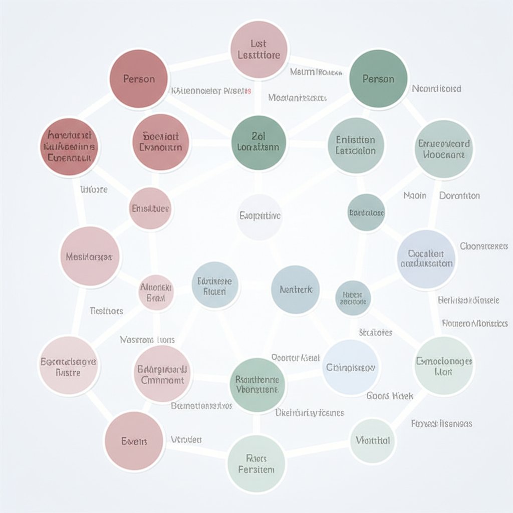
A link analysis chart is a data visualization tool designed to illustrate relationships and connections between different entities. It represents entities like people, organizations, or events as nodes (points) and their relationships as links (lines). This network-based approach enables analysts to uncover hidden patterns, complex networks, and critical insights within large datasets that might be missed in traditional spreadsheets or tables.
What Is a Link Analysis Chart?
A link analysis chart is a powerful method for visualizing and understanding complex relationships within data. Unlike traditional data formats that store information in rows and columns, a link chart focuses on the connections themselves, treating them as first-class citizens. As described in ArcGIS Pro's documentation, this visualization is a complementary view to a map, revealing non-spatial relationships that are critical for many types of investigation.
The chart is built on two fundamental components:
- Nodes: These represent the individual entities within your data. An entity can be any distinct person, place, object, or event. For example, in a criminal investigation, nodes could represent suspects, vehicles, bank accounts, or crime scenes.
- Links: These are the lines that connect the nodes, visually representing a relationship or interaction between them. A link could signify a phone call between two suspects, a financial transaction between two accounts, or a person being present at a specific location.
This structure of nodes and links forms a network or graph. By mapping data this way, analysts can move beyond simple data points to see the entire ecosystem of connections. According to experts at Linkurious, this visual approach makes it significantly easier and faster for the human brain to spot important trends, patterns, and anomalies that are often invisible in tabular data. The method is particularly effective for combining data from multiple, disparate sources into a single, holistic view.
A common framework for identifying entities is the POLE (People, Objects, Locations, and Events) method, highlighted by the i2 Group. For example, a chart could link a person (node) to a location (node) they visited, which is also the site of an event (node) involving a specific object (node). This comprehensive modeling helps build a complete picture of a situation, making link analysis an indispensable tool for intelligence and investigation.
Core Applications and Use Cases
The ability of link analysis to clarify complex networks makes it invaluable across numerous industries where understanding connections is critical. By visualizing relationships, organizations can move from raw data to actionable intelligence. This technique is not just about seeing who is connected, but understanding the structure and dynamics of the entire network.
Here are some of the primary applications of link analysis charts:
- Law Enforcement and Intelligence: This is one of the original and most prominent uses. As noted by Cambridge Intelligence, agencies use link analysis to map criminal and terrorist networks. By connecting suspects, communications, financial transactions, and locations, investigators can identify key players, uncover hierarchies, and predict future activities. For example, visualizing call data records can reveal the command structure of an organized crime group.
- Fraud Detection: Fraudsters often operate in sophisticated, coordinated rings. Link analysis is exceptionally effective at uncovering these networks. For instance, in insurance fraud, a chart can connect multiple claimants, doctors, and lawyers who are all associated with a suspiciously high number of claims. Linkurious provides a powerful example of identifying fake car accident claims by visualizing networks of shared policyholders, vehicles, and repair shops that would otherwise appear unrelated.
- Cybersecurity: In the digital realm, link analysis helps security professionals identify and mitigate threats. Analysts can map the connections between malicious IP addresses, domains, malware strains, and attack vectors. This allows them to see the infrastructure behind a cyber attack, identify the source, and understand the pattern of behavior to prevent future incidents. Visualizing network traffic can reveal anomalies that indicate an ongoing breach.
- Financial Crime and Anti-Money Laundering (AML): Financial institutions use link analysis to trace the flow of illicit funds. By charting transactions between accounts, shell corporations, and individuals across different jurisdictions, analysts can identify money laundering schemes and complex financial crimes. The visualization helps in following the money trail, even when criminals attempt to obscure it through multiple layers of transactions.
In each of these cases, the core benefit is the same: transforming vast, disconnected data into a clear, interactive map of relationships. This allows analysts to not only validate or disprove hypotheses but also to discover entirely new and unexpected patterns of interest that are crucial for decision-making.
How to Perform Link Analysis: A Step-by-Step Approach
Creating and analyzing a link chart is a systematic process that transforms raw data into a visual field for investigation. While the specific tools may vary, the fundamental methodology follows a clear path from data collection to insight generation. The process, as outlined by sources like Cambridge Intelligence, can be broken down into four main stages.
- Data Collection and Aggregation: The first step is to gather all relevant data. A key strength of link analysis is its ability to unify information from disparate sources. This could include structured data from databases (like transaction logs or call records) and unstructured data from documents, emails, or websites. The goal is to bring all potential pieces of the puzzle into one place.
- Data Cleansing and Entity Extraction: Raw data is often messy. This stage involves cleaning the data to normalize formats, remove duplicates, and resolve identities (a process known as entity resolution). The system then extracts the key entities (the nodes, such as people, companies, and locations) and the relationships that connect them (the links). For example, a text document might be processed to pull out names of individuals and identify that they communicated via email.
- Building the Data Model and Visualization: With clean data, the next step is to model it as a network of nodes and links. This involves defining what constitutes an entity and a relationship in your specific context. The data is then loaded into a tool that can generate the visual link chart. This is the point where abstract data points become an interactive graph that can be explored visually.
- Analysis and Exploration: The final and most crucial step is the analysis itself. This is not a passive viewing process but an active investigation. Analysts interact with the chart by filtering data, expanding nodes to see more connections, applying different layouts, and using analytical algorithms to highlight key parts of the network. The objective is to identify patterns, find key connectors, and answer the investigative questions that prompted the analysis.
When it comes to tools, options range from simple manual methods to highly sophisticated software. Many users look for solutions like a "link analysis chart in Excel," which can be suitable for small, simple datasets. However, for more complex investigations, dedicated software is often necessary.
| Tool Type | Pros | Cons |
|---|---|---|
| Manual (e.g., Excel, Whiteboard) | Low cost, accessible, good for simple problems. | Does not scale, prone to errors, lacks advanced features. |
| Specialized Software (e.g., i2 Analyst's Notebook) | Powerful analytical features, scalable to large datasets, built for investigation. | Higher cost, requires training. |
| Developer SDKs (e.g., KeyLines, ReGraph) | Fully customizable, can be integrated into existing applications. | Requires software development resources. |
Key Analytical Techniques in Link Analysis
Creating the link chart is just the beginning; its true power is realized through advanced analytical techniques that reveal the underlying structure and significance of the network. These methods, often built into specialized software, help analysts move beyond simple visual inspection to mathematically identify the most important parts of the data. As the i2 Group explains, these techniques are essential for drawing out deeper insights.
One of the most common sets of techniques is Social Network Analysis (SNA). SNA provides centrality measures to quantify the importance of each node in the network. Key measures include:
- Degree Centrality: This measures the number of direct connections a node has. A node with a high degree is highly connected and often acts as a hub of activity. In a criminal network, this could be a person who communicates with many other members.
- Betweenness Centrality: This identifies nodes that act as bridges or gatekeepers on the shortest paths between other nodes. A person with high betweenness may control the flow of information or resources between different subgroups. Removing such a node could fragment the network.
- Closeness Centrality: This measures how quickly a node can reach all other nodes in the network. A node with high closeness can spread information efficiently and may be in a prime position to have an overview of the network's activities.
Beyond SNA, other analytical methods are crucial. Pathway discovery is used to find the shortest or most significant paths between two or more nodes of interest, revealing non-obvious connections. For example, it can show how two seemingly unrelated individuals are connected through a chain of intermediaries. Clustering analysis automatically identifies tightly-knit groups or communities within the larger network. In a fraud investigation, this could instantly reveal a fraud ring by grouping individuals who share common addresses, phone numbers, or bank accounts.
Finally, temporal analysis adds the dimension of time to the link chart. By plotting events and relationships on a timeline, analysts can understand the sequence of activities, identify periods of high or low activity, and see how the network evolves. This is critical for understanding cause-and-effect and for reconstructing the narrative of an investigation. By combining these techniques, an analyst can transform a static chart into a dynamic model for deep, evidence-based discovery.

Frequently Asked Questions
1. What is a link analysis chart?
A link analysis chart is a data visualization that shows relationships between entities. It uses nodes (often circles or icons) to represent entities like people, places, or things, and links (lines) to represent the connections between them. Its main purpose is to help analysts understand complex networks and uncover hidden patterns.
2. How do you make a link analysis chart?
The process generally involves four steps: 1) collecting and combining data from various sources, 2) cleaning the data and extracting the key entities and relationships, 3) using software to model the data as a network and create the visual chart, and 4) analyzing the chart to find insights by exploring connections and applying analytical techniques like social network analysis.
3. What is a link chart?
A link chart is another term for a link analysis chart or network graph. It is composed of nodes (representing entities) and links (representing relationships). These charts are used in various fields, including law enforcement, cybersecurity, and fraud detection, to make sense of complex, interconnected data.


